import matplotlib.pyplot as plt4 Graphing Data
Graphs are fundamental tools for inspecting and communicating with data.
We begin by importing the pyplot plotting library.
Given data in lists or arrays, we can simply plot that data!
x = [0, 1, 2, 3, 4, 5, 6]
y = [4, 8, 6, 9, 7, 6, 8]
plt.plot(x,y)
plt.show() 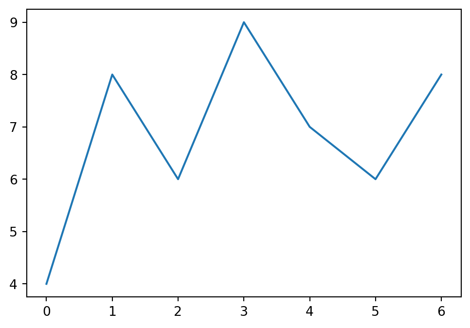
4.1 Title and Labels
Plotting is not complete unless your plot is properly labeled. A common sequence of commands for plotting with labels may look like this:
# Data
year = [1800, 1830, 1880, 1900, 1920, 1990, 2000]
Boston = [24937, 61392, 362839, 560862, 748060, 874283, 589141]
NewYork = [60000, 185000, 1919000, 3802000, 7798000, 16044000, 17800000]

plt.plot(year, Boston, label='Boston')
plt.plot(year, NewYork, label='New York')

# Display with labels
plt.xlabel('Year')
plt.ylabel('Population')
plt.title('City Populations')
plt.grid()
plt.legend()
plt.show() 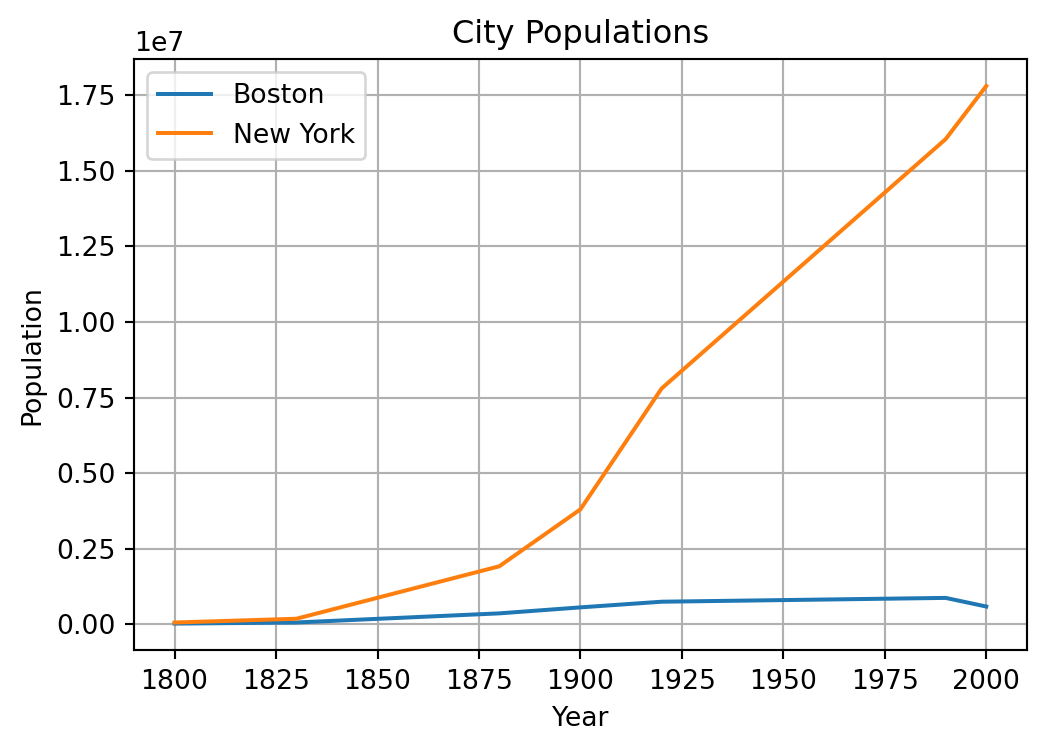
Note that we called plt.plot() twice before calling plt.show(), which results in the two plots appearing on the same figure.
4.2 Graph Types
Below are five scenarios that demonstrate five different types of useful Graphs. In addition to the graph, axes are labeled and figures are titled.
Line Plot
The line chart is the default graph type in pyplot. Consider the following data representing time and distance traveled during a road trip.
| \(t\) | 0 | 1 | 2 | 3 | 4 | 5 | 6 |
|---|---|---|---|---|---|---|---|
| \(d\) | 0 | 42 | 101 | 132 | 138 | 190 | 218 |
t = [ 0,  1,   2,   3,   4,   5,   6]      # Time in hours
d = [ 0, 42, 101, 132, 138, 190, 218]      # Distance in miles

plt.plot(t,d)

plt.xlabel('Time (hours)')
plt.ylabel('Distance (miles)')
plt.title('Road Trip Progress')
plt.show()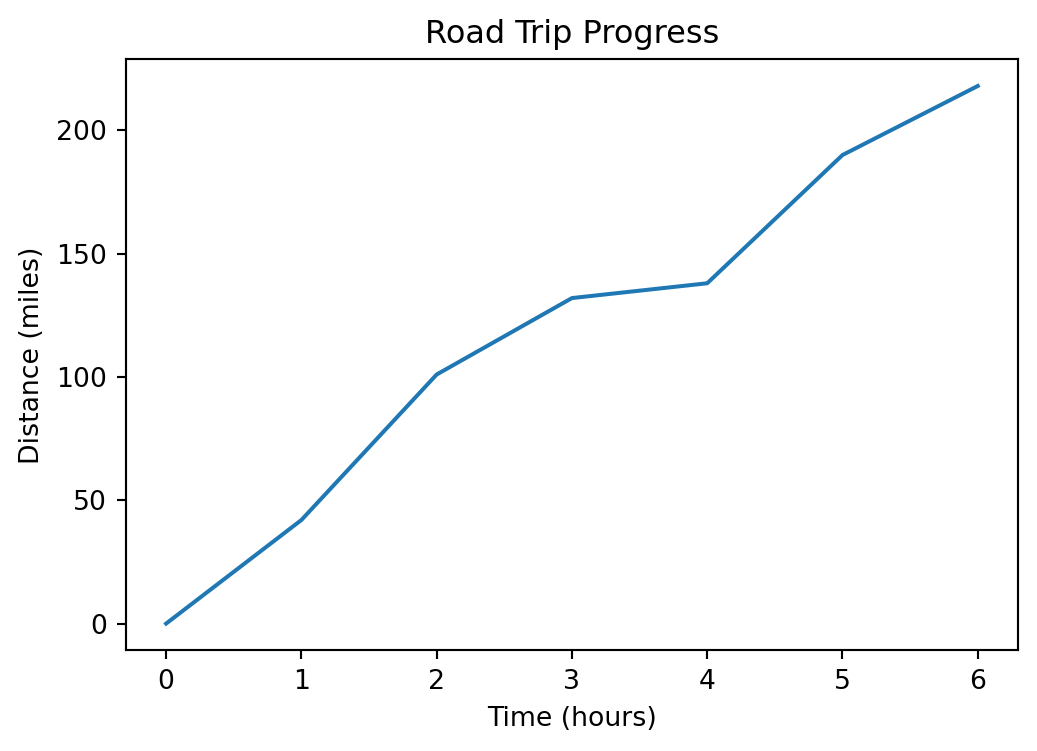
Scatter Plot
The following data represents the weight \(w\) and price \(p\) for a set of cars.
| \(w\) | 2840 | 2900 | 3000 | 2950 | 3150 | 3200 | 3700 | 3900 | 3650 | 3950 |
|---|---|---|---|---|---|---|---|---|---|---|
| \(p\) | 22000 | 23500 | 21000 | 21500 | 26000 | 2700 | 31000 | 34000 | 39000 | 44000 |
A scatter plot is useful for inspecting and visualizing relationships between variables.
# Weight in pounds, price in dollars
w = [ 2840, 2900, 3000, 2950, 3150, 3200, 3700, 3900, 3650, 3950]
p = [ 22000, 23500, 21000, 21500, 26000, 27000, 31000, 34000, 39000, 44000]

plt.scatter(w,p)

plt.xlabel('Weight (lb)')
plt.ylabel('Price (dollars)')
plt.title('Price per weight of common vehicles')
plt.show() 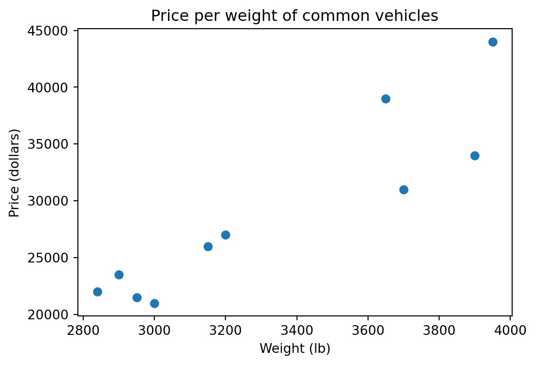
Bar Chart
A bar chart is useful for comparing different categories. Consider the results of a student survey on study methods:
study_methods = ["Flashcards", "ChatBot", "YouTube", "Group Study", "Notes"]
counts = [3, 8, 5, 19, 8]

plt.bar(study_methods, counts)

plt.xlabel("Study Method")
plt.ylabel("Number of Students")
plt.title("Preferred Study Methods")

plt.show()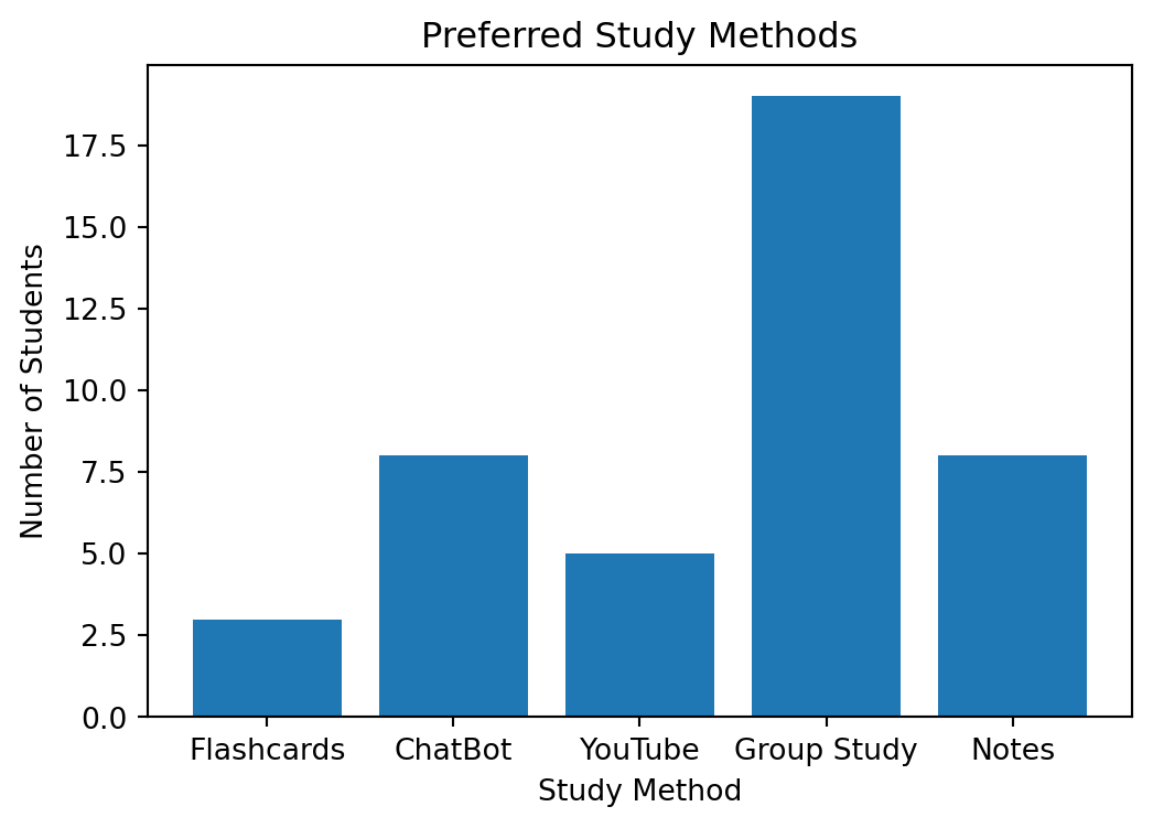
Histogram
A histogram can give you an immediate sense of the distribution of values. Consider the quiz scores in the following example:
scores = [ 2, 3, 4, 4, 5, 5, 5, 6, 6, 7,
           7, 7, 8, 8, 8, 8, 9, 9, 10, 10 ]

plt.hist(scores, bins=9, edgecolor='black')

plt.xlabel('Score out of 10')
plt.title('Quiz Score Distribution')
plt.show()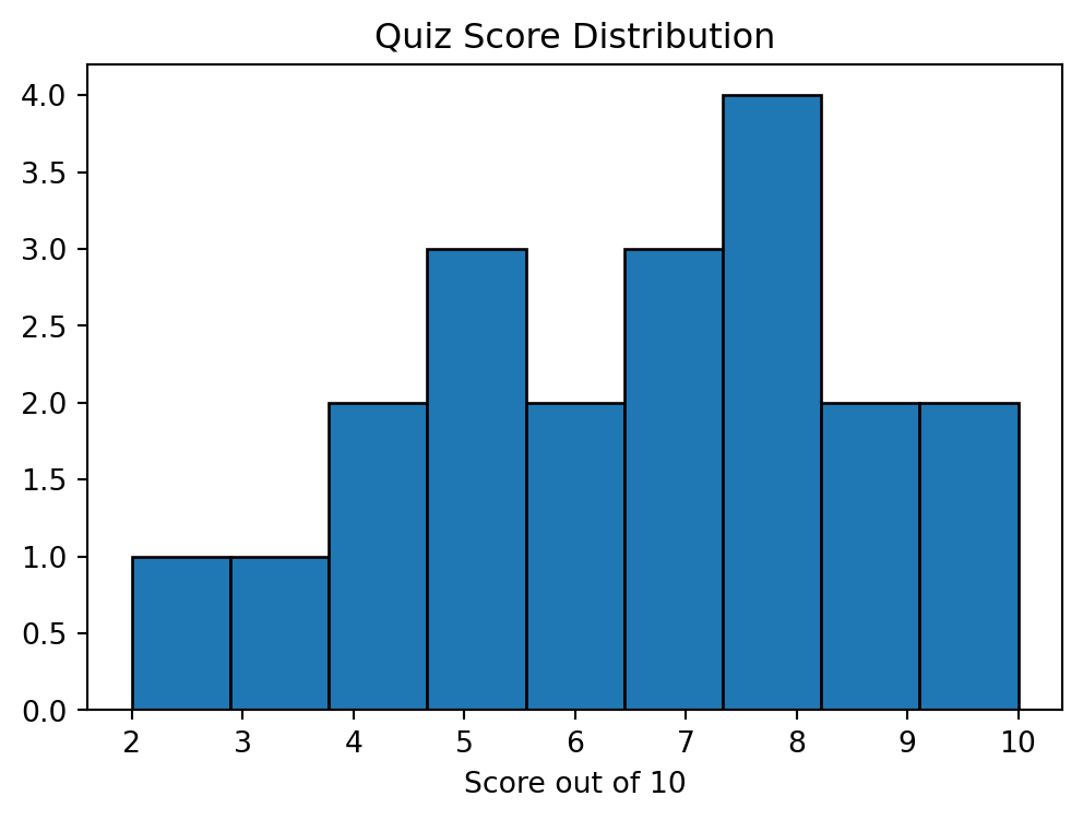
We used bins=9 to set the number of histogram bins to 9, and edgecolor='black' to help the bins stand out visually.
We frequently want to compare distributions by plotting them in the same figure. Here is an example with quiz scores from two classes:
class_A = [5, 6, 5, 7, 6, 5, 8, 6, 7, 5, 4, 6, 7, 5, 6]
class_B = [9, 8, 10, 9, 10, 8, 9, 10, 6, 8, 9, 7, 8, 10, 9]

plt.hist(class_A, alpha=0.7, bins=9, label='Class A')
plt.hist(class_B, alpha=0.7, bins=9, label='Class B')

plt.legend()
plt.xlabel('Score out of 10')
plt.title('Quiz Score Distributions by Class')
plt.show()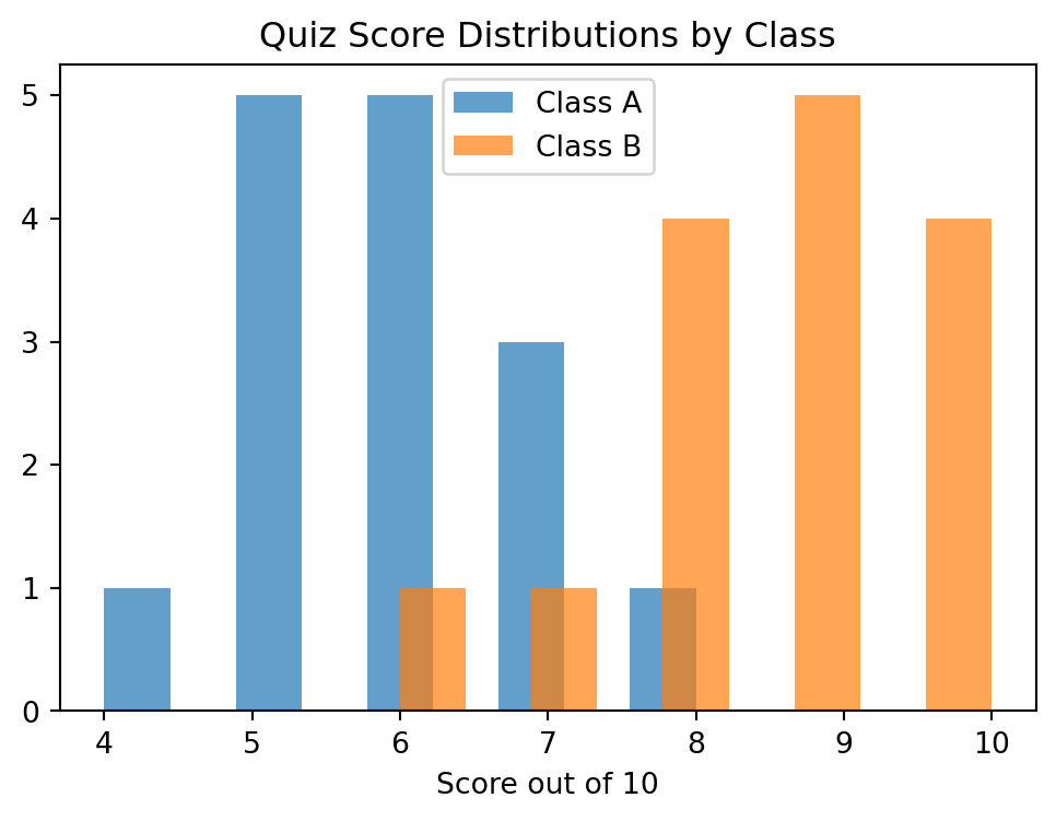
alpha=0.7 sets the transparency for each histogram in the figure. An alpha value of 0 would be invisible while 1 would be completely opaque.
Box Plot
A box plot is a different view of the same type of data we saw with a histogram, and is also useful for comparing distributions.
class_A = [5, 6, 5, 7, 6, 5, 8, 6, 7, 5, 4, 6, 7, 5, 6]
class_B = [9, 8, 10, 9, 10, 8, 9, 10, 6, 8, 9, 7, 8, 10, 9]

plt.boxplot(
    [class_A, class_B],
    labels=["Class A", "Class B"]
)

plt.title('Quiz Score Distributions by Class')
plt.show()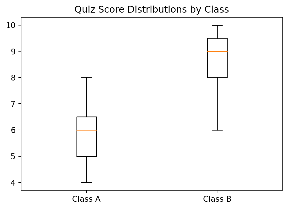
It is not required that we break up the boxplot command onto different lines. It simply helps with readability. Additional categories can be added by extending the lists of data and tick_labels.
4.2.1 Plot Summary
- Line Plot – Shows how a value changes over time or across an ordered sequence. Points are connected with lines to highlight trends.
- Scatter Plot – Displays the relationship between two numerical variables using individual points. It helps reveal patterns, trends, or correlations.
- Bar Chart – Compares values across categories. The height of each bar represents the size or value of a category.
- Histogram – Shows the distribution of numerical data by grouping values into bins. It helps to see the overall shape of the distribution and where data are concentrated.
- Box Plot – Summarizes a dataset using the median, quartiles, and possible outliers. It is useful for comparing distributions and understanding spread and variability.
Exercises
A cup of tea at 100\(^\circ\)C is left in a room at 22\(^\circ\)C. The temperature of the tea \(T\) is recorded over \(t\) minutes in the table below. Create a line plot of the tea data and be sure to label the axes.
t 0 5 10 15 20 25 30 35 40 T 100 86 74 66 57 51 45 42 38 Graph the following data set as a scatter plot. On the same plot, draw an approximate best fit line to the data (note that this line will be an estimate, and you can draw a line between two \((x,y)\) coordinates).
x 0 1 2 3 4 5 6 7 8 9 y 12.5 13.1 13.2 13.2 13.8 14.1 15 14.8 14.9 15.1 Perform a reflex test (or use previous data). Have one person place their hand at the edge of a table with their fingers out. A second person holds a ruler just above the first person’s finger tips and lets go at a random time. Without moving their hand, the first person closes their fingers to stop the ruler. For each person,
- Collect 12 samples of how far the ruler falls before it is caught.
- Put the data into a NumPy array.
- Create a histogram for each person depicting the distribution of their reflex times.
- Create a box plot for each person depicting the distribution of their reflex times.
Consider a pendulum with mass \(m\), length \(L\), and release angle \(\theta\). The period \(T\) of a pendulum is the amount of time it takes to complete one cycle of motion, swinging from one side to the other and then back again. To model the period of a pendulum, we want to determine the effect that each of the variables \(m\), \(L\), and \(\theta\) have on \(T\). We can explore this experimentally by keeping two of the variables constant while changing the third and looking for changes in \(T\).